



Porsche 917 K Gulf Poster | The Livery That Became a Legend
Porsche 917 K Gulf Poster – Powder blue and marigold orange – how one paint scheme outlived the car it was designed for
There are colours that belong to a place, and colours that belong to nothing at all — they simply exist, floating above context, recognised by people who have never set foot on a racetrack. Powder blue over marigold orange is one of those colours. You could show it to someone who has never heard the name Porsche and they would still feel it: the calm, the speed, the sun on wet tarmac at Brands Hatch in 1970. It’s exactly that split-second recognition I set out to hold onto in every Porsche 917 K Gulf poster in this collection.
The Shape Before the Colour
Before it wore a single stripe of paint, the Porsche 917 was already a study in tension — a long, low silhouette built for one purpose: to go faster in a straight line than anything else on the grid. Its tail tapered like something drawn rather than engineered, a shape that seemed to apologise for how much power sat behind the driver’s shoulders. When Gulf’s livery landed on that shape, something clicked. The car stopped looking like a machine and started looking like a piece of graphic design that happened to also win races.
A Colour Scheme Born From Oil, Not Art
The irony is worth sitting with: Gulf Oil’s livery wasn’t conceived by an artist chasing beauty. It was a corporate colour scheme, chosen for visibility and brand recognition on television broadcasts. And yet — sometimes commerce accidentally produces poetry. The pale blue reads as sky, or sea, or nothing at all; the orange cuts across it like a signature, urgent and warm. Fifty years on, people who couldn’t tell you a single lap time from that era can still identify the livery instantly. That’s not marketing anymore. That’s iconography.
Brands Hatch, 1970
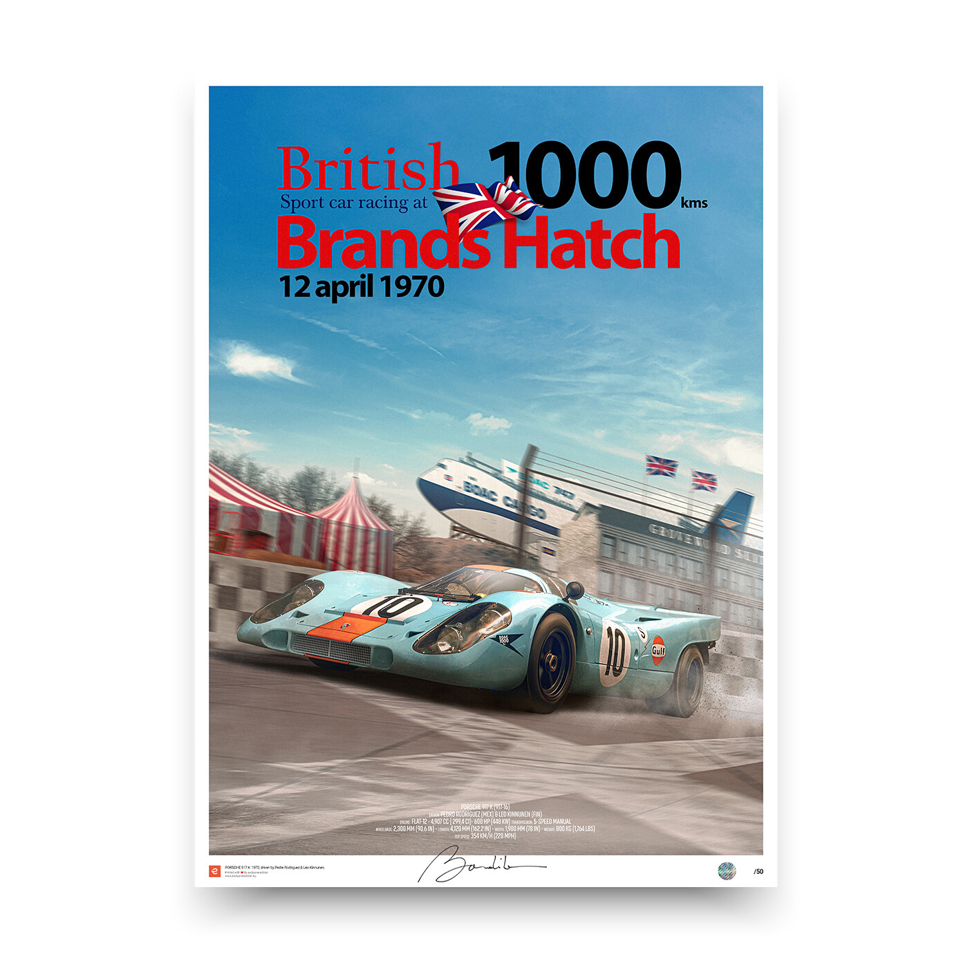
Picture the scene: a British circuit under grey southern skies, damp air clinging to the trees around the paddock, and this pale blue shape cutting through it — improbable, almost wrong, like a splash of Mediterranean light dropped into a Kent afternoon. That contrast is what I try to hold onto when I compose a piece like this. Not just the machine, but the way it doesn’t quite belong to its surroundings, and how that tension is exactly what makes it unforgettable.
The Boeing at the Trackside
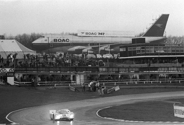
The photograph that first pulled me into this piece isn’t really about the car at all — not at first glance. It’s a shot from that same era at the circuit: a 917 leaning into a corner in the rain, and behind it, towering over the pit straight, an almost full-scale wooden billboard shaped like a BOAC Boeing 747. A structure that size, built from timber and scaffolding, standing trackside as an advert — it feels like something from another century entirely. You’d never see it now. Safety regulations alone would end the idea before it left the drawing board, and there’s something quietly moving about that: a piece of 1970s showmanship so confident it built an aeroplane out of wood just to sell plane tickets to people watching cars.
What kept me looking, though, wasn’t the audacity of it. It was the accidental conversation happening between the two machines. The 747’s fuselage and that enormous tail fin are pure aerodynamic logic — every curve dictated by air, nothing decorative, nothing wasted. And there, dwarfed at the foot of it, the 917 K carries exactly the same logic at a tenth of the scale: a long tapering tail, a nose shaped by wind rather than whim. Two completely different eras of engineering, one built to leave the ground and one built to stay glued to it, arriving at strangely similar answers to the same question — how do you cut through the air with the least resistance possible. That parallel, more than the livery, is what made me want to draw this car in the first place.
Composing the Porsche 917 K Gulf Poster
Every piece in this collection starts the same way: not with a blank page, but with a scale model on the desk in front of me, turned slowly under the light until it finds the angle that tells the truth about it. I photograph it from there — sometimes dozens of frames before one earns its place — and then the real work begins in Photoshop, building the scene around it layer by layer. For this Porsche 917 K Gulf poster specifically, the challenge wasn’t accuracy — it was restraint. The livery already does the work; a poster’s job is to let it breathe. I stripped the background back to almost nothing, let the long nose of the car lead the eye, and left the orange to do what it’s always done: interrupt the calm just enough to make you look twice. That’s the whole idea behind a minimalist composition — not simplifying the car, but clearing away everything that isn’t essential to its identity.
Why It Still Stops People
I think what makes the 917 K Gulf endure isn’t the trophies — though there were plenty — it’s that the car photographs like a piece of art before it ever crosses a finish line. That’s the whole reason this Porsche 917 K Gulf poster exists: every angle offers a new relationship between the blue and the orange, the curve of the fender and the flat panel of the door. Most race liveries fade into their era. This one didn’t. It became a language of its own, one that designers, photographers, and yes, poster artists, keep returning to because it never stops giving something new to look at.
Some cars win races. This one won something rarer: it won a colour palette a permanent place in visual culture, long after the engines went quiet.
My Evocation
Poster Details
Size: Multi formats available
Print technology: HD 12-Color pigment ink
Paper: Fine Art Matte 190 gr
Production
Quantity: Limited edition (50)
Signed by Art Director: Yes
Numbered: Yes
Security hologram sticker: Yes
Framing: Not including
Delivery
Posters are packed and delivered in a protective tube to ensure a safe delivery