



Ferrari 250 GTO Poster | The Silhouette Every Car Artist Chases
Ferrari 250 GTO: The Silhouette Every Car Artist Chases
On Sicilian mountain roads, a shape was born that designers still can’t improve on
Ask anyone who spends their time turning cars into art which silhouette gives them the least trouble, and more often than not, they’ll name the same machine: the Ferrari 250 GTO. Not because it’s simple — nothing about a body this sculpted is simple — but because every line already knows where it’s going. There’s nothing to fix. You just have to get out of its way, which is exactly the brief I gave myself for this Ferrari 250 GTO poster.
A Line That Needs No Explanation
Long bonnet, cabin pushed back towards the rear axle, a roofline that drops and rises again like a held breath — the proportions of the 250 GTO read as inevitable, as though no other shape could ever have made sense for what the car was built to do. That’s rare. Most beautiful cars are beautiful because of one detail, one flourish. The GTO is beautiful because of the whole sentence, not a single word in it.
Targa Florio, 1964
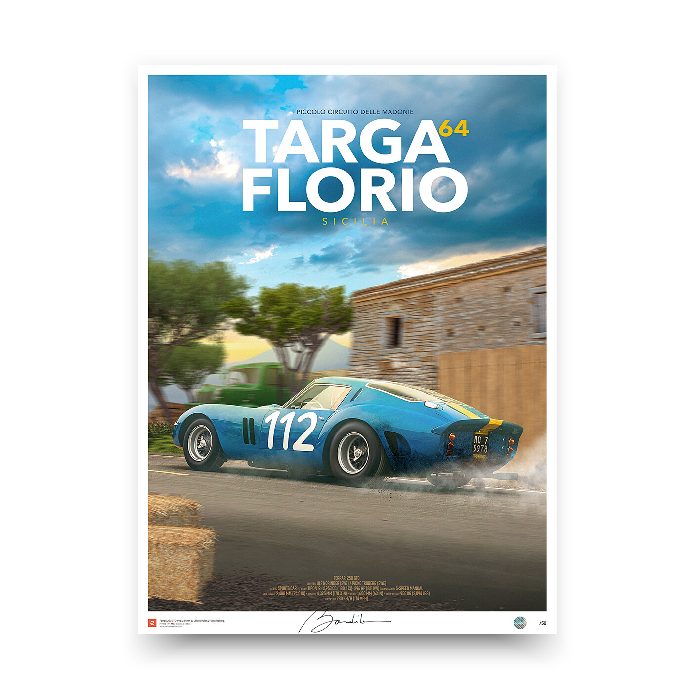
I chose to set this piece against the Targa Florio — the road race that wound through the mountains of Sicily, past stone villages and hairpins carved into rock older than the sport itself. It felt right. A car this considered deserved a backdrop with equal weight: not a sanitised circuit, but real roads, real dust, real risk. The blue and yellow of Ulf Norinder’s Swedish racing livery against that ochre landscape is a colour story I could have painted for weeks and not grown tired of.
A Different Angle on the Same Village
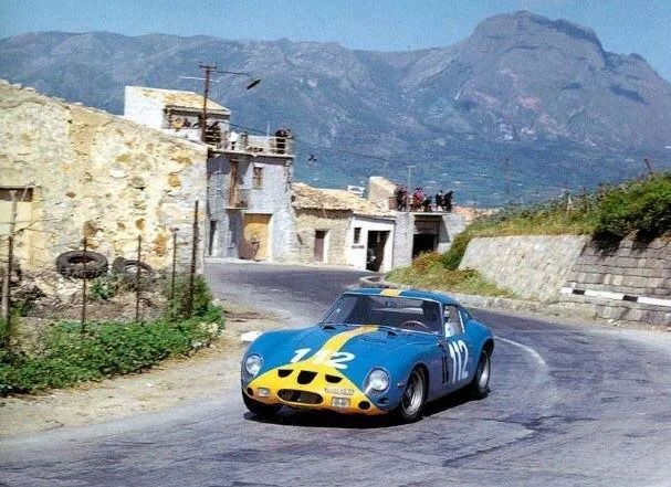
The photograph that started this piece is a period shot of car #112 threading its way out of a Sicilian village — stone houses, a mountain standing guard in the distance, spectators watching from a rooftop terrace. It’s a beautiful photograph, but it’s shot almost head-on, the car coming straight at the camera, and something about that angle always left me wanting more. A car this sculpted deserves to be seen in profile, where every line of the bodywork can actually be read from nose to tail.
So that’s what I set out to do: keep the same village, the same mountain standing in the background, the same stone walls catching the afternoon light — but turn the car to show its full side-on silhouette instead. Front-on, a car reads as a fact: it’s coming towards you, that’s all you know. In profile, it reads as motion — you can trace exactly where it’s been and where it’s about to go, and that alone does more to suggest speed than any blur or motion line ever could. Reworking a real moment from a different vantage point, rather than simply copying the original photograph, is exactly the kind of decision that turns a reference image into a piece of its own.
Why Artists Keep Returning to It
There’s a reason the GTO appears, in one form or another, in nearly every serious collection of automotive art — mine included. It isn’t nostalgia. It’s that the shape rewards attention the way a good painting does: the longer you look, the more you notice how each curve sets up the next one. Shoot it minimalist, shoot it detailed, render it in monochrome or full colour — the bones underneath never let you down.
The Weight of Rarity
Part of what makes the GTO impossible to separate from its own myth is scarcity. Only a handful were ever built, and today it’s regularly cited as the most valuable car in the world at auction. But I’ll admit — the price tag interests me far less than the way light falls across that rear haunch, or how the nose seems to lean forward even when the car is standing still. Rarity explains the value. It doesn’t explain the beauty. The beauty was always going to be there, price tag or not.
Composing the Ferrari 250 GTO Poster
For this Ferrari 250 GTO poster, I leaned into negative space — letting the Sicilian road stretch out ahead of the car rather than crowding the frame with detail. The goal was to give the eye somewhere to travel, the same way a driver’s eye would have travelled across those mountain switchbacks. A poster of a car this iconic doesn’t need decoration. It needs room.
A Shape That Doesn’t Age
Sixty years on, nothing about the GTO reads as dated. Put it beside a modern supercar and it holds its own, not through nostalgia but through sheer clarity of form. That’s the mark of real design — automotive or otherwise. It doesn’t need its era to make sense. It simply is what it always was: correct.
My Evocation
Poster Details
Size: Multi formats available
Print technology: HD 12-Color pigment ink
Paper: Fine Art Matte 190 gr
Production
Quantity: Limited edition (50)
Signed by Art Director: Yes
Numbered: Yes
Security hologram sticker: Yes
Framing: Not including
Delivery
Posters are packed and delivered in a protective tube to ensure a safe delivery