



Jaguar D-Type Poster | The Underdog Shape That Beat Them All
Jaguar D-Type: The Underdog Shape That Beat Them All – Jaguar D-Type poster
A small Scottish garage, a colour called Flag Blue, and a body shaped more like an aircraft than a car
Some racing stories are about factories with unlimited budgets. This one isn’t. Ecurie Ecosse was a private team run out of Edinburgh, founded by an accountant and a mechanic who wanted to put Scotland on the motorsport map — and somehow, against works teams with far deeper pockets, they did it in a car whose beauty came from the same place as its speed: a shape drawn not by a stylist, but by an aircraft engineer. That’s the story this Jaguar D-Type poster is really about.
A Body Built Like an Aeroplane
The Jaguar D-Type was shaped by Malcolm Sayer, a man who’d spent the war years working on aircraft design before Jaguar ever gave him a car to draw. It shows. The D-Type’s monocoque tub, its long sculpted nose, the small stabilising fin behind the driver’s headrest — none of it reads as decoration. Every curve exists because moving air told it to be there. Sayer would go on to shape the E-Type a few years later, but there’s an argument that the D-Type is the purer object: rougher, more urgent, closer to the wind-tunnel logic that built it in the first place.
Reims, 1956
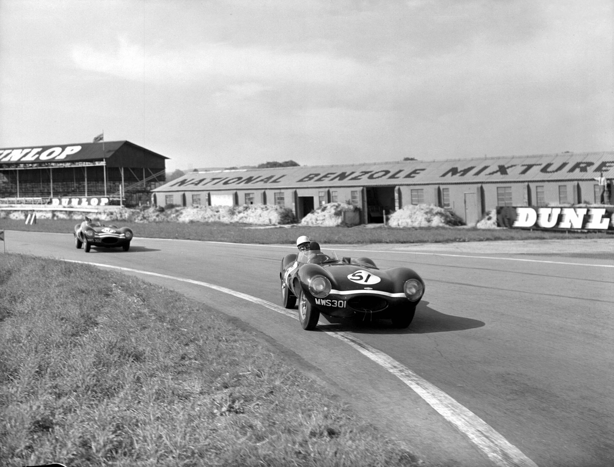
I set this piece at the 12 Hours of Reims in 1956, one of the fast, flowing road circuits of that era, cut through open French farmland rather than fenced into a permanent track. It suits the D-Type’s shape — a car built for sustained high speed, not tight corners, photographed somewhere that actually let it stretch its legs. Ecurie Ecosse ran their cars in a colour they called Flag Metallic Blue, a shade with just enough depth to catch the light differently every time the car changes angle, which made it a genuine pleasure to compose against the flat gold of a French summer field.
The Team Nobody Expected
What pulls me back to Ecurie Ecosse, beyond the shape of the car, is the size of the story against the size of the operation. This was a handful of Scottish mechanics and a couple of race-bred drivers, running against the full might of the works teams — and coming away not just competitive, but victorious, at Le Mans in both 1956 and 1957. There’s something worth holding onto in that: proof that a small team with a well-shaped idea can still out-run an organisation ten times its size. It’s not a bad thing to think about while running a small studio yourself.
One of the First Pieces I Ever Made
This one has a different story behind it than most of what I make now. It was one of my earliest pieces, put together with the help of an intern at the time, and we did it entirely in 3D — a genuine experiment, back before I’d settled on the way I work today. I’ve since moved away from 3D completely. Everything I make now starts with a real, physical scale model photographed under real light, because that’s where the honesty of the final image comes from. But this piece stays in the collection as it was, a small record of where the process started.
A Tribute Built Into the Whole Frame
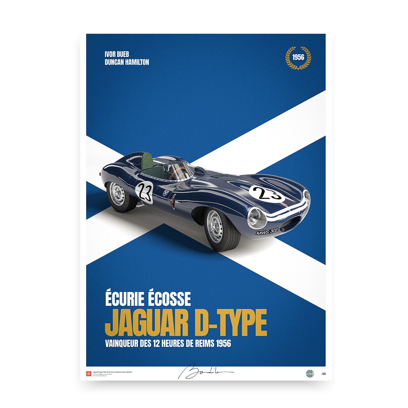
What I wanted this piece to do, beyond capturing the car, was pay tribute to Ecurie Ecosse itself — a small team representing a small nation, taking on giants and winning. So rather than tuck a flag into a corner, I let the Saltire take over the entire composition: Scotland’s white diagonal cross on blue, filling the frame edge to edge, with the D-Type posed as though it’s driving straight out of the flag itself rather than simply standing in front of it. The car’s own paintwork picks up the same idea — a central white stripe running the length of the blue bodywork, echoing the cross behind it, so the livery and the backdrop read as one continuous piece of graphic design rather than a car placed on a flag.
The rest of the composition leans into that graphic instinct too: a gold laurel wreath marking out 1956, the drivers’ names — Ivor Bueb and Duncan Hamilton, the pairing that actually won at Reims that year — set in bold type above the car, and “Écurie Écosse” and “Jaguar D-Type” carrying the same confident, poster-like weight as the flag underneath them. It’s a different way of working to how I approach most pieces now, closer to a piece of team branding than a photographic study, and looking back, that’s exactly what made it the right way to honour this particular story.
Composing the Jaguar D-Type Poster
What struck me even in that early 3D piece was how little the D-Type needs from a composition to look fast standing still. I kept the frame low and wide, let the long bonnet run almost the full width of the piece, and left the fin at the rear to close the silhouette rather than cluttering the scene with spectators or pit equipment. A shape this considered doesn’t need company. For the full Jaguar D-Type poster, the aim was to let Sayer’s aerodynamic logic do exactly what it always did on track: quietly outperform everything louder around it.
Why the Shape Still Holds Up
Put a D-Type next to almost anything else from the mid-1950s and it looks like it arrived from a different decade — not through exaggeration, but through sheer economy of form. Nothing about it needed to be added later to make it look modern. It already was. That’s the real legacy of a car shaped by someone thinking about air rather than fashion: it doesn’t age the way fashion does. Seventy years on, the Jaguar D-Type still reads as correct, and that’s a far rarer achievement than any single race result.
My Evocation
Poster Details
Size: Multi formats available
Print technology: HD 12-Color pigment ink
Paper: Fine Art Matte 190 gr
Production
Quantity: Limited edition (50)
Signed by Art Director: Yes
Numbered: Yes
Security hologram sticker: Yes
Framing: Not including
Delivery
Posters are packed and delivered in a protective tube to ensure a safe delivery